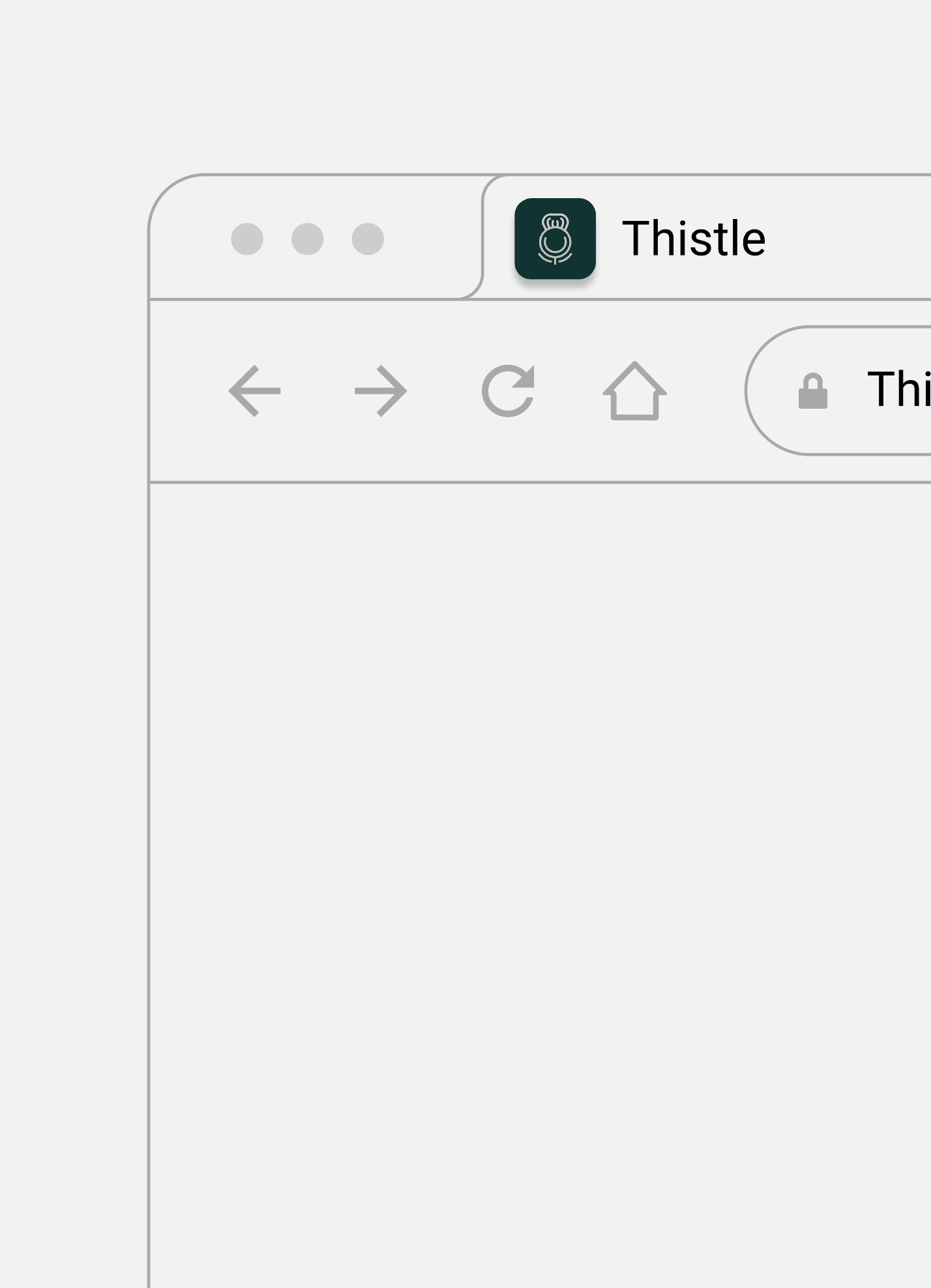
Thistle case study

Thistle is a modern home workout app built to help busy people stay consistent with their fitness through guided programmes, community accountability, and progress tracking, creating a supportive experience that keeps users motivated and committed to their goals.

Tools used for the project

Tools used for the project

Adobe Illustrator

Adobe Photoshop

Notion

Project deliverables

Project deliverables

Logo

Wordmark

Tools used

Adobe Illustrator

Adobe Photoshop

Notion

Tools used

Adobe Illustrator

Adobe Photoshop

Notion

The task I was given:

The task I was given:

Thistle is a home workout app designed to make exercise more accessible for busy people. It focuses on encouraging people to stay active through small programmes, progress tracking, and accountability with their friends.

The founder already had the app built but needed a logo before launch.


My task was to create an identity that felt modern, motivating, and recognisable while clearly reflecting the Scottish thistle the brand was named after. The logo also needed to work at small sizes, across social media, and future brand applications as the brand grows.

Phase 1: Defining the visual direction

Phase 1: Defining the visual direction

Instead of going straight into logo concepts, I gave my client a questionnaire to get to know everything about their company, their target audience, their future goals, how they wanted the brand to be seen etc. This gave me a better information on where it is now, and where they want it to go in the future.


I was then able to start creating moodboards and exploring possible visual directions so the founder could see the overall direction and personality of the brand before moving into the final design, so that we were on the same page. After I created the moodboards I wrote reasonings behind my choices linked to the founders information from the questionnaire.


After the founder reviewed each direction and read the reasonings, Moodboard 1 was selected.

Phase 2: Sketching

Phase 2: Sketching

With the visual direction agreed, I began sketching logo concepts.


The goal was to simplify the shape of the Scottish thistle into a recognisable mark that would remain clear even at app icon size. In this stage, I explored different ways of intertwining the thistle with the subtle fitness symbolism of a kettlebell to represent strength and fitness.


Every concept was designed with scalability and long-term flexibility in mind.

Stage 3: Concept development & iteration

Stage 3: Concept development & iteration

The first concept

Reasoning:

The logo is inspired by the natural structure of the Scottish thistle.

  • The top curves represent the thistle petals.

  • The centre reflects the flower head.

  • The lower lines simplify the stem and leaves into a clean geometric form.


The thistle is combined with the silhouette of a kettlebell to connect the brand with fitness.

  • The outer shape follows the form of a kettlebell.

  • The lower curves suggest movement and strength.

  • The result is a simple icon that represents both the Scottish thistle and home fitness.

Reasoning behind the concept:

The logo is inspired by the natural structure of the Scottish thistle.


  • The top curves represent the thistle petals.

  • The centre reflects the flower head.

  • The lower lines simplify the stem and leaves into a clean geometric form.


The thistle is combined with the outline of a kettlebell to connect the brand with fitness.

  • The outer shape follows the form of a kettlebell.

  • The lower curves suggest movement and strength.

  • The result is a simple icon that represents both the Scottish thistle and home fitness.

Feedback on first concept

The client's only feedback was that they felt that the kettlebell shape suggested a traditional gym rather than home workouts. The client also wanted purple to be incorporated into the logo, so that it still emphasise the thistle.

The second concept

The second concept

Reasoning behind the concept:

I refined the icon to place greater emphasis on the Scottish thistle while keeping the overall concept intact.


  • Widened the base and narrowed the upper section to create a subtle upward shape showing progress and growth.

  • Made the centre circle into an oval to reduce the shape of the kettlebell.

  • Maintained a clean, geometric, and symmetrical design.

Reasoning behind the concept:

I refined the icon to place greater emphasis on the Scottish thistle while keeping the overall concept intact.


  • Widened the base and narrowed the upper section to create a subtle upward shape showing progress and growth.

  • Made the centre circle into an oval to reduce the shape of the kettlebell.

  • Maintained a clean, geometric, and symmetrical design.


Feedback on first concept

After reviewing the refined concept, the client decided to return to the original design, with purple included. The first kettlebell concept had grown on them, and the client felt it provided greater flexibility should the brand expand into equipment-based or gym workouts in the future.

The final result

Client Testimonial

"I can't recommend Edona enough. She brought my vision to life perfectly, with a clean, professional design that captures exactly what I was looking for. She has great communication skills and is very responsive, which made the whole process smooth and easy.


I'm absolutely delighted and would recommend Edona to anyone in need of quality design work."

Agron Elshani

Founder @ Thistle Fit

Empathy-led design work with deep research, polished visuals, and a calm result from first idea to finished page.

© 2026 ENM Designs. All rights reserved.

Built with care, clarity, and a little bit of blueness.

Empathy-led design work with deep research, polished visuals, and a calm result from first idea to finished page.

© 2026 ENM Designs. All rights reserved.

Built with care, clarity, and a little bit of blueness.

Empathy-led design work with deep research, polished visuals, and a calm result from first idea to finished page.

© 2026 ENM Designs. All rights reserved.

Built with care, clarity, and a little bit of blueness.

Empathy-led design work with deep research, polished visuals, and a calm result from first idea to finished page.

© 2026 ENM Designs. All rights reserved.

Built with care, clarity, and a little bit of blueness.